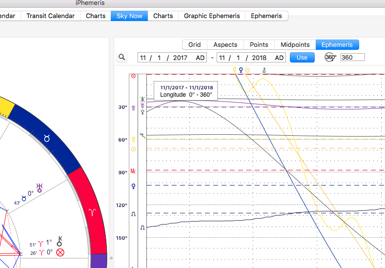
Graphic Ephemeris (MacOS)
May 31, 2016iOS Graphic Ephemeris
June 14, 2016
When enabled (see iPhemeris Store), the Graphic Ephemeris Chart Report shows up as a new tab in the Reports section of Charts and Sky Now. For full details on how it works see the previous section:
- Click the Search Button to display a pop up window showing data under the mouse.
- Select a date range to display.
- Click the Use button to update after a new chart is selected.
- Harmonic ranges are shown using the degree entry field to the right of the Use button.
- Declination data is not available in the Charts or Sky Now Reports view.
- When a Horoscope is being displayed, the positions of the first chart (inner most wheel) are overlaid on the Graphic Ephemeris. These positions are shown as horizontal dashed lines.
DISPLAYED POINTS
- The planets and points selected to display on the Horoscope wheel will be included on the main graphic ephemeris chart (wavy lines).
- The planets and points selected to display in Reports will be used for the dotted line overlays.