iOS Graphic Ephemeris
June 14, 2016iOS Other Settings
April 25, 2017

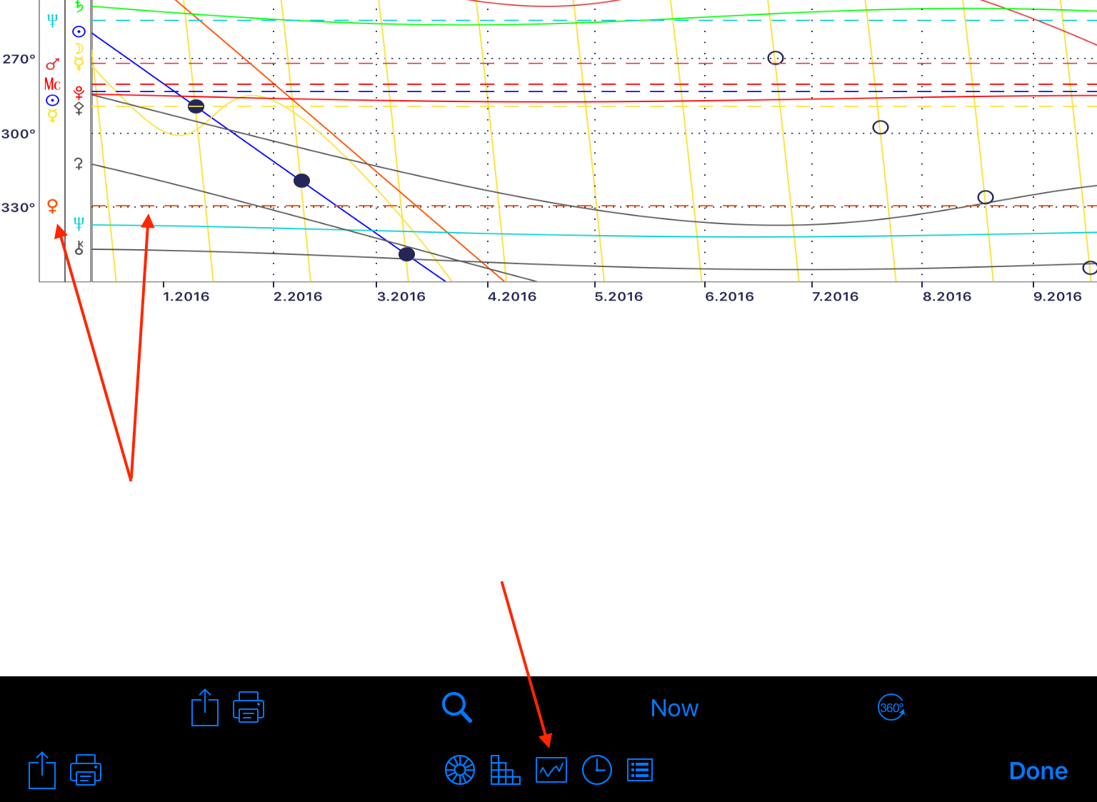
When enabled, the Graphic Ephemeris Chart Report shows up as a new button on the Chart Display toolbar. For full details on how it works and what the buttons do, see the previous section. In brief you can:
- Select a date range to display.
- Display 6 months either side of now.
- Select a harmonic degree range for Longitude.
- Declination data cannot be shown with chart data.
- When a horoscope is selected for display, the positions of the first chart (inner most wheel) are overlaid on the Graphic Ephemeris. These positions are shown as horizontal dashed lines.